Welcome SMS reports
Here in this section, we want to show you how all report descriptions will be structured. Each section in this guide contains a description of the overall dashboard as well as a breakdown of the sections (charts, tables, etc.) with an accompanying sample visual.
When the data is represented as an aggregate per a calendar date, the time is in UTC.
|
| For help with using Kibana reports, check out Kibana’s Documentation. Kibana’s guides will instruct you best on how to use the general functions of the dashboards. |
Location Update Dashboard
The Location Update dashboard details in 4 charts the total count for location update descriptions as well as the location update triggers by VPLMN, country, and zone.
The data in these reports are pulled from the Location Update CDR. See the CDR section in this guide for more details.
|
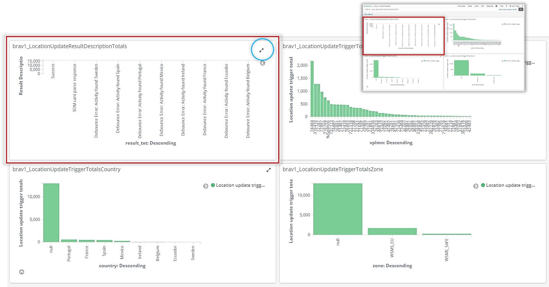
Location Update Description Total
The Location Update Description Total chart shows the update description total. The y-axis details the total count over the specified time period whereas the x-axis shows the descriptions themselves.
A few examples of descriptions might be success, debounce error, or SOM cannot parse. However, these will vary per deployment.
| Click the expand button to get a better view of the chart if it is too condensed on your dashboard. |
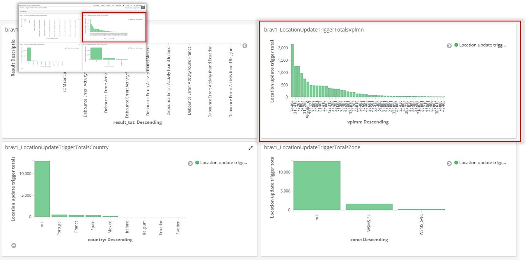
Location Update Trigger by VPLMN
The Location Update Trigger by VPLMN chart shows the update trigger total by VPLMN. The y-axis details the total count over the specified time period whereas the x-axis shows the VPLMNs themselves.
| Click the expand button to get a better view of the chart if it is too condensed on your dashboard. |
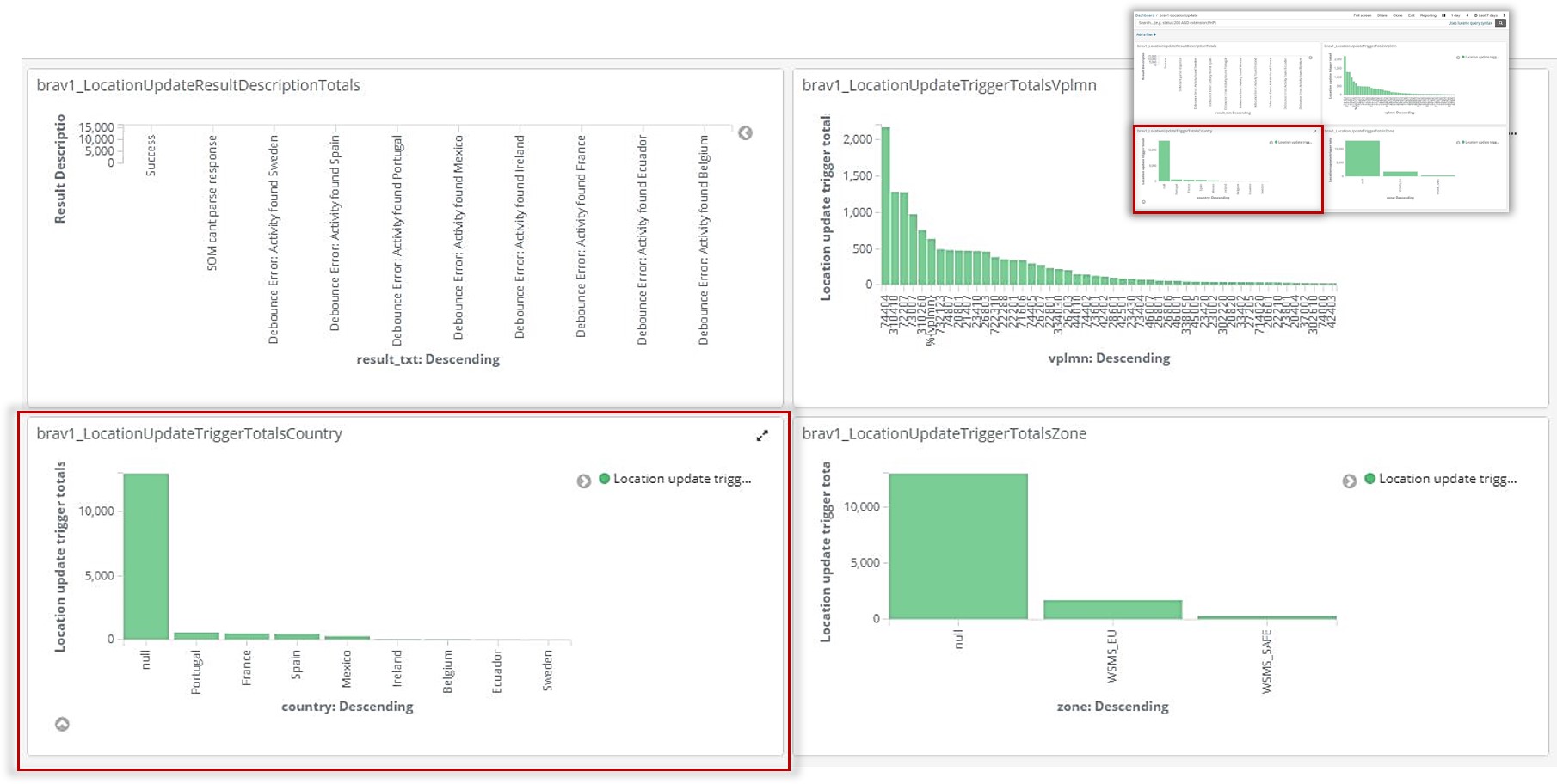
Location Update Trigger by Country
The Location Update Trigger by Country chart shows the update trigger total by country. The y-axis details the total count over the specified time period whereas the x-axis shows the countries themselves.
| Click the expand button to get a better view of the chart if it is too condensed on your dashboard. |
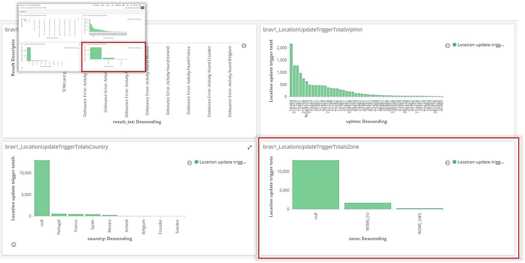
Location Update Trigger by Zone
The Location Update Trigger by Zone chart shows the update trigger total by VPLMN. The y-axis details the total count over the specified time period whereas the x-axis shows the zones themselves.
| Click the expand button to get a better view of the chart if it is too condensed on your dashboard. |
Notification Dashboard
The Notification dashboard details in the total count for Welcome SMS notifications, the unique subscriber count as well as the notifications sent by VPLMN, status code, and service key.
The data in these reports are pulled from the Notification Update CDR. See the CDR section in this guide for more details.
|
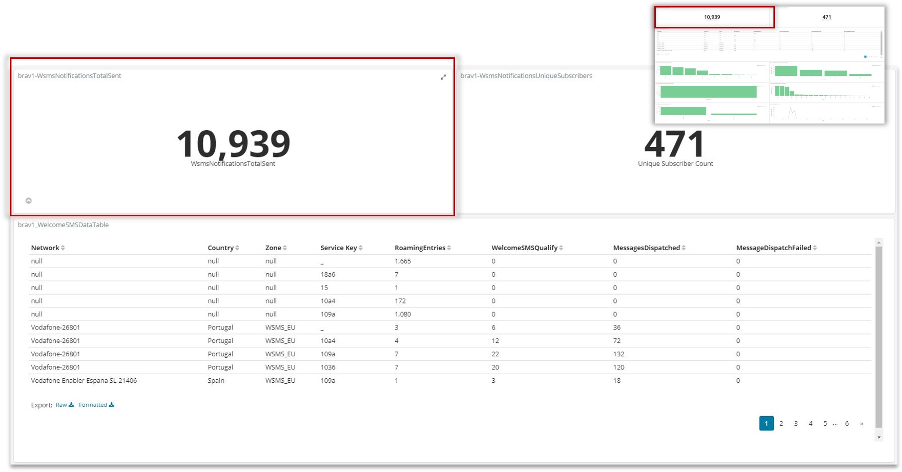
WSMS Notifications Total
The top jumbotron for total WSMS notifications sent simply displays the complete total, regardless of category, of WSMS notifications sent in the specified time frame. This way you can quickly see the sheer number of subscribers being reached in an easy to view counter.
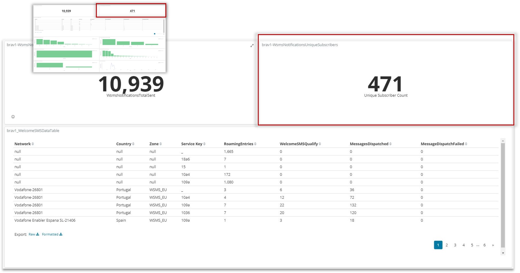
WSMS Notifications Total by Unique Subscribers
The top jumbotron for total WSMS notifications sent by unique subscribers simply displays the complete total of unique subscribers to whom a Welcome SMS notification was sent. This way you can quickly see the sheer number of subscribers being reached in an easy to view counter.
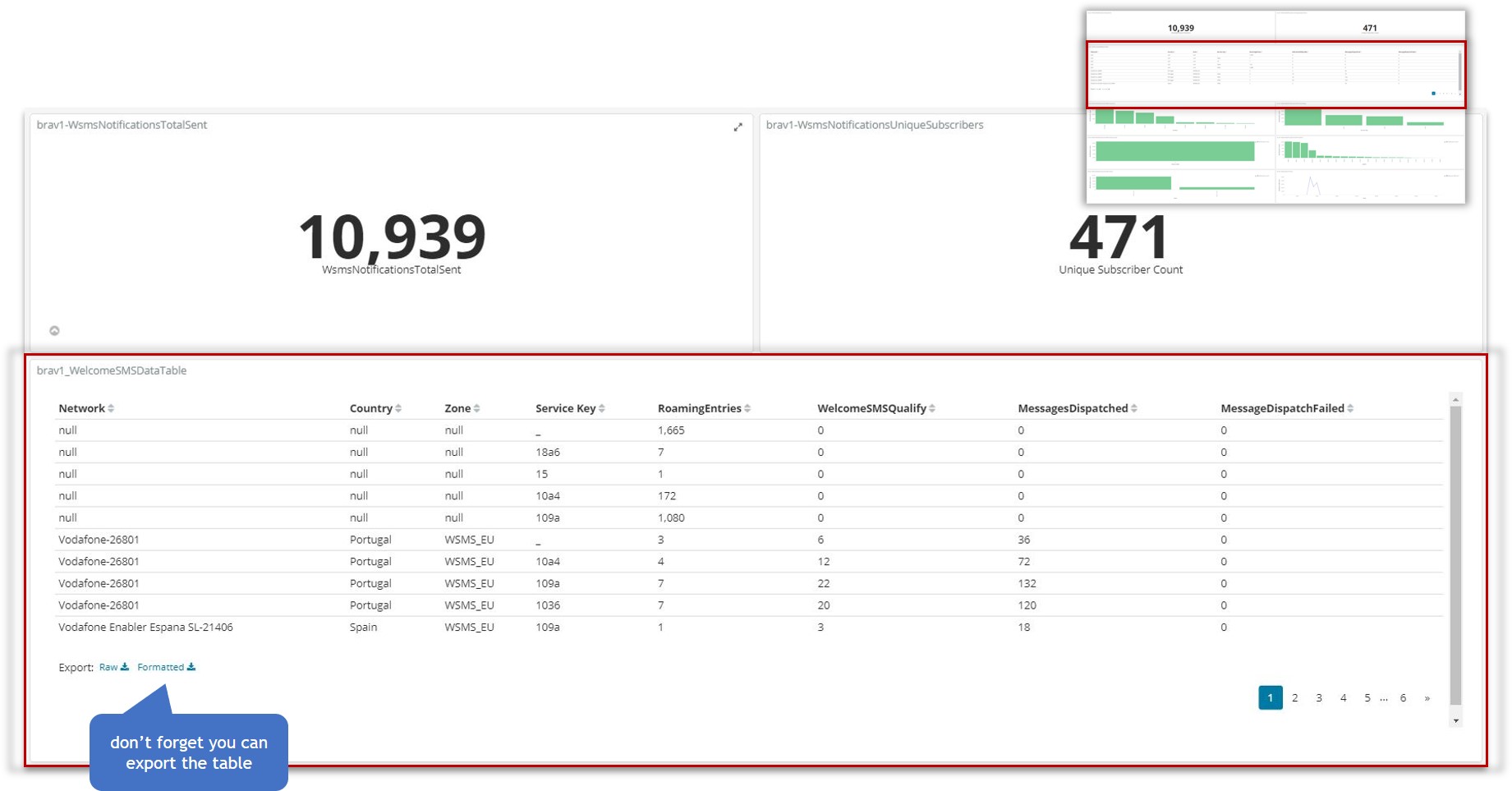
WSMS Data Table
The WSMS Data Table provides a detailed view into WSMS notifications, enabling you to look at roaming entries within certain zones and how many of those entries qualified for welcome SMS notifications as well as how many welcome sms notifications either were dispatched or failed.
| Click the expand button to get a better view of the chart if it is too condensed on your dashboard. |
WSMS Notifications Sent by Country
The WSMS Notifications by Country chart shows total number of notifications broken down by countries. The y-axis details the total count over the specified time period whereas the x-axis shows the countries themselves.
| Click the expand button to get a better view of the chart if it is too condensed on your dashboard. |

WSMS Notifications Sent by Service Key
The WSMS Notifications by Service Key chart shows total number of notifications broken down by the service key. The y-axis details the total count over the specified time period whereas the x-axis shows the keys themselves.
| Click the expand button to get a better view of the chart if it is too condensed on your dashboard. |

WSMS Notifications Sent by Status Code
The WSMS Notifications by Status Code chart shows total number of notifications broken down by status codes. The y-axis details the total count over the specified time period whereas the x-axis shows the codes themselves.
| Click the expand button to get a better view of the chart if it is too condensed on your dashboard. |

WSMS Notifications Sent by VPLMN
The WSMS Notifications by VPLMN chart shows total number of notifications broken down by VPLMN. The y-axis details the total count over the specified time period whereas the x-axis shows the VPLMNs themselves.
| Click the expand button to get a better view of the chart if it is too condensed on your dashboard. |

WSMS Notifications Sent by Zone
The WSMS Notifications by Zone chart shows total number of notifications broken down by zone. The y-axis details the total count over the specified time period whereas the x-axis shows the zones themselves.
| Click the expand button to get a better view of the chart if it is too condensed on your dashboard. |

WSMS Notifications Trend
The WSMS Notifications Trend line chart displasy the total number of Welcome SMS notifications sent over a specified time period, giving you an idea of the trend of messages being dispatched.
| Click the expand button to get a better view of the chart if it is too condensed on your dashboard. |
